1. Define the Problem
The Problem
My 84 year old Aunt had difficulty registering online for the COVID-19 Vaccine. I wanted to create a site that simplified the vaccine registration process for a senior user that was not technologically savvy, or may have impairments or limitations.
Pain Point #1
It was very difficult to overcome user reluctance to register online because of technical difficulties and lack of comfort with computers.
Pain Point #2
Navigating to irrelevant information. Senior users noted that they did not want to scroll through tons of information in order to be able to register.
Pain Point #3
Unclear directions for the sign-in process. No helpful hints or prompts that allowed the user to easily register for the vaccine.
Pain Point #4
Possible Solutions
- Create a website that would be easier to navigate and inform the user. The improved site should have less information to read, would provide directions via audio instruction and would enable them to register quickly and easily.
- Create a website that would train the senior user to be more proficient in using the computer, which would facilitate an easier registration process.
- Design a website or app that allowed the user to speak through the registration process. This would prevent the need for keying in data and information. The user would be guided through the registration process by voice prompt instruction, with an audio assist device which would record their responses. This would provide accessibility to all persons disabled, or who have impairments.
Goal
My Approach & Design Process


Key Skills:
• UX Design • User Research • User Testing
• Information Architecture • Personas
• Sketching • Mockups • Wireframing
• Prototyping • Metrics & Analytics • Design Sprint • Problem Solving • Affinity Maps
• Empathy Maps • Interviews • User Flows
• Journey Maps • User Story • Agile Methodology • Design Thinking • Web Design
- UX Design
- User Research
- User Testing
- Information Architecture
- Personas
- Sketching
- Mockups
- Wireframing
- Prototyping
- Metrics & Analytics
- Design Sprint
- Problem Solving
- Affinity Maps
- Empathy Maps
- Interviews
- User Flows
- Journey Maps
- User Story
- Agile Methodology
- Design Thinking
- Web Design
2. Research
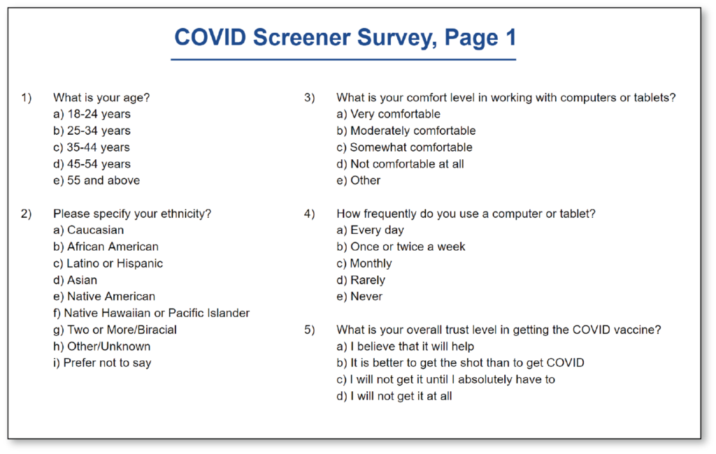
Screener Survey Questions
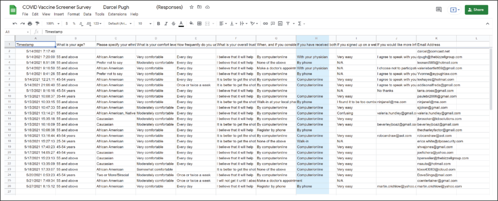
Define the Problem: Create a COVID-19 registration website for senior citizens (user/target audience), who may be visually or hearing impaired, that will eliminate the need to search for information, preventing unnecessary clicking, and to make the site easier to navigate for those that are not comfortable using technology. I tested 24 people, ranging in ages from 50-76.
Background User Research
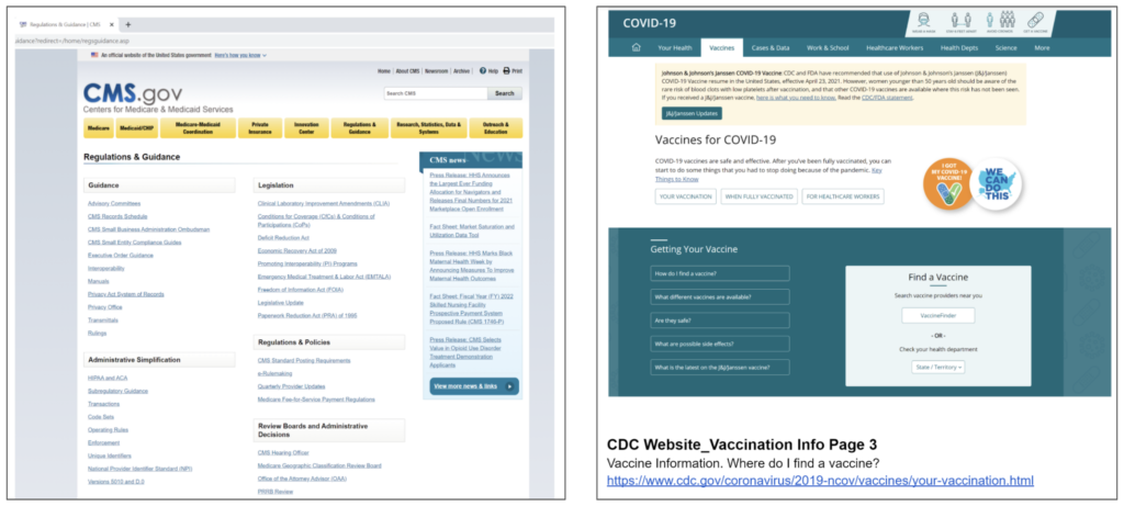
Through user interviews, comparison website reviews, and card sorts, I discovered that many senior users wanted to have information readily available in order to save time searching for what they needed. The current medical websites required much searching, unnecessary clicking, broken hyperlinks, buried information, and no audio prompts to aid the user in the registration process.
Comparison Research
Research was conducted by visiting the major medical and non-medical websites, such as The Centers for Disease Control and Prevention (CDC), The Department of Health and Human Services (DHHS), American Association of Retired Persons (AARP), and The World Health Organization (WHO), to name a few.
Link to Comparison Analysis Documents:
METRICS AND ANALYTICS
User Interviews

In the discovery phase of my project, I conducted user interviews to get a better understanding of the problem or pain points that seniors were experiencing in the registration process.
Guiding Questions:
- How frequently do you use a computer or tablet?
- What is your overall trust level in getting the COVID vaccine?
- When, and if you consider getting the COVID vaccine, how will you register? Online, walk-in, or with your healthcare provider?
- What is your age?
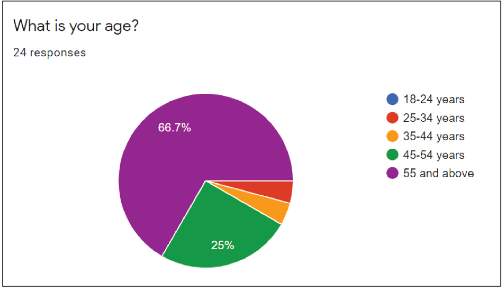
Some of the main insights that I got from the interviews was that many seniors were not comfortable using a computer, and those that were, experienced technical issues such as slow loading pages, broken hyperlinks, too much information or content, crucial data that was buried, or very difficult to find. Based upon user feedback, I realized that I needed to simplify the registration site, make the information more accessible, and easier to find.
COVID-19 SCREENER SURVEY RESULTS
66.7%
Of respondents
were ages 55+
3. Personas
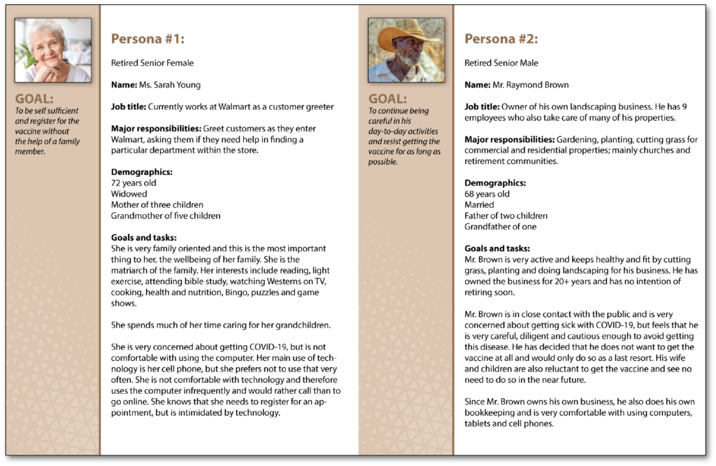
Synthesize users into 2 key groups; those that wanted the vaccine and those that did not
Interview Insights: Many senior users were reluctant to take the vaccine. Those that did want the vaccine, thought that the online registration process should be easier because they didn’t want to go into an office or clinic where they could possibly risk being exposed to the virus. The remaining users did not want to take the vaccine unless it was a last resort. Based upon these results, I developed 2 very distinct personas with opposing beliefs.
4. Ideate
Sketches and Low Fidelity Wireframes
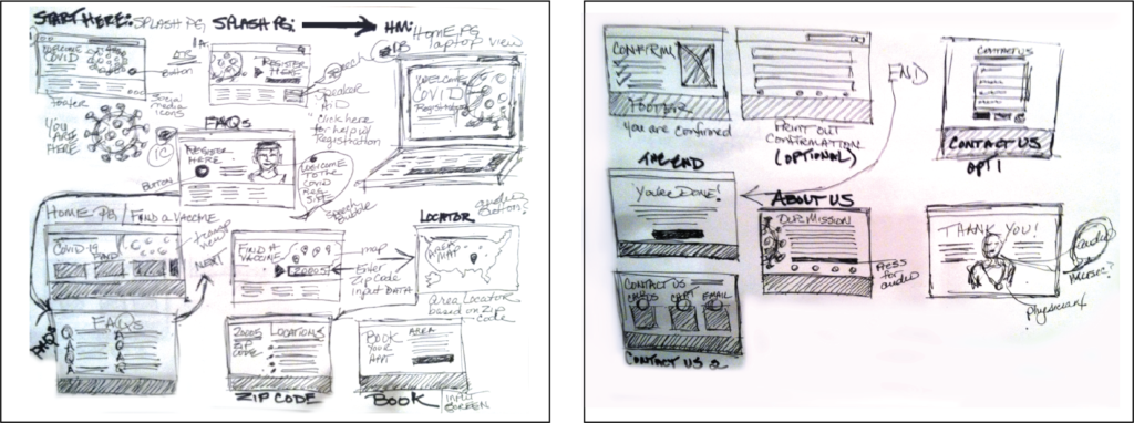
Early Sketches. Based upon my early usability studies, the 5 users had various issues with the initial design. 3 of 5 users had trouble viewing the time slot buttons on the “Find Vaccines” screen; all independently thought that they were too small and very hard to read without magnifying the area. 3 of 5 users mentioned that I should have another screen, which navigates to the in-store (Wegman’s) registration confirmation screen after the 10am button was clicked.
There was no screen created for this function at the time. Therefore, 60% out of 100 thought that the site needed an extra screen for in-store confirmation and larger text on the time slot buttons, or larger buttons for legibility. I synthesized all of the research and findings to create the screens that I eventually built for my prototype.
The solution to these 2 problems was to redesign one screen and create a Confirmation screen. On the “Find Vaccines” screen, I increased the size of the buttons and font for the time slots to increase visibility. I also created a Confirmation screen after the user clicked the 10:00 AM time button to register for the vaccine.
Mid Fidelity Wireframes
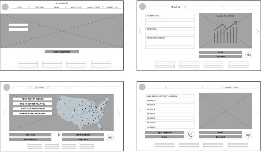
Before moving onto high fidelity wireframes, I did Guerrilla Usability Tests, where each participant was given a scenario to visit a COVID registration website. I asked each person what steps they would take to register for the vaccine, in particular, where they thought that the Registration information should be for them to easily access it. I showed each person my low fidelity mockups, most responded that the most efficient and easiest way to navigate, was to put the information on the Home Page where it could be easily found.
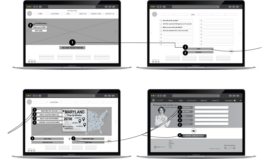
Therefore, I added a Registration button on the Home page, which is reflected in my wireframes. The design has had many iterations, but the Home Page information has remained constant. The development of the wireframes changed after user feedback. The finished prototype included their changes. Hotspots were added for the active buttons. Built in Adobe XD and InVision.
Design Thinking - The Evolution of My Process
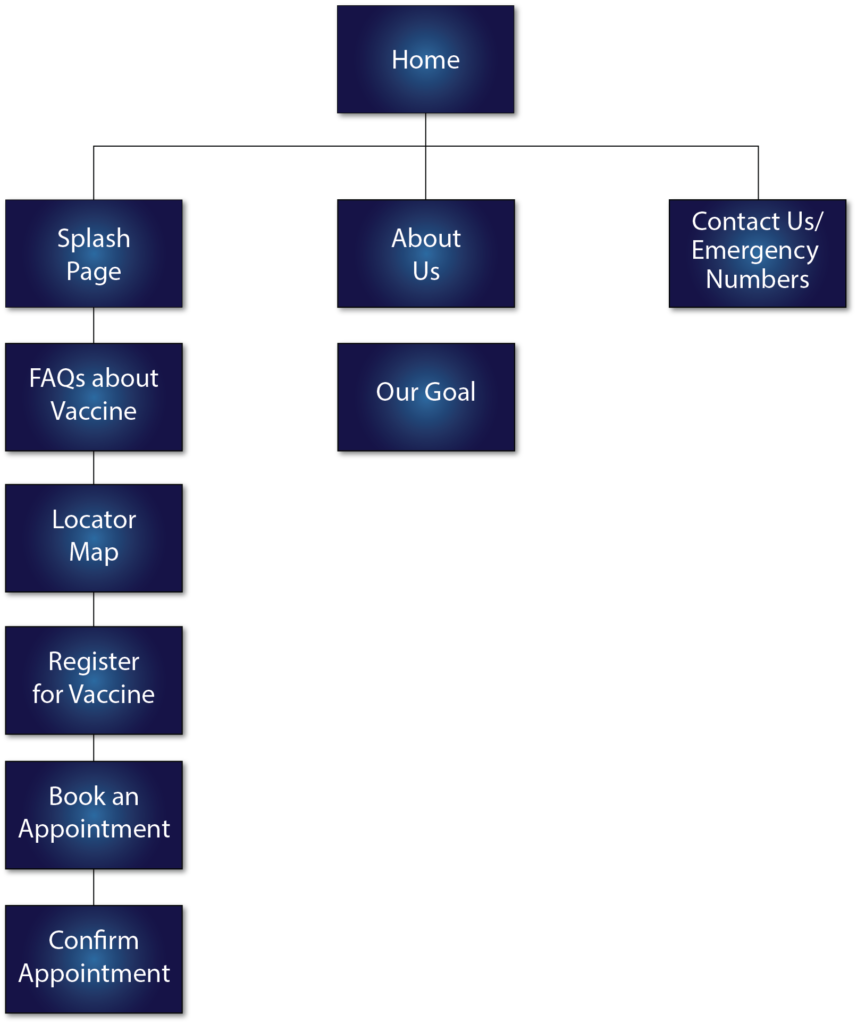
The first round of paper mockups were okay for the initial Guerrilla Testing, but they did not give an accurate representation of the information that I needed to convey. The first wireframes were screens without a footer, or an adequate navigation bar. The second round of iterations included these elements, but since I was designing a website, I decided to put the screens on a laptop to have a more realistic experience for the second round of user testing. This increased overall feedback and led me to add the additional screens for the vaccine registration sites and confirmation screens. With the prototype now in Adobe XD, I was able to create my wireframes and final prototype with hotspots.
Mood Board, Color Palette and Style Guide
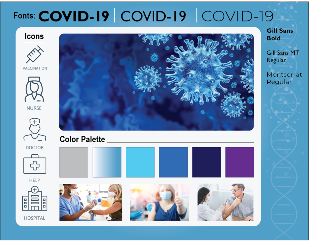
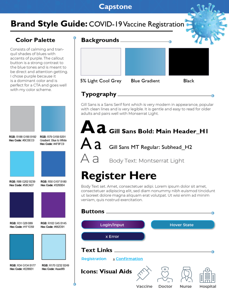
The Brand Style Guide and Mood Board are both designed with the senior user in mind. I have used a very soothing color palette in tones of blues, which are known to be calming, reassuring, trustworthy, and very easy to read when combined with text and imagery. The Call to Action button is a strong contrast to the blue tones and is meant to be the most prominent element on the page. All decisions were meant to keep the senior user in mind. The ultimate goal was to design a MVP that was easy to navigate and help the user get the critical information that they needed for the COVID vaccine registration process. Helpful icons were added to aid the user in navigating to relevant information.
Typography: Gill Sans Bold for Headlines, Gill Sans MT Regular for Subheads, Montserrat Regular and Montserrat Light for body text.
I chose to use images of physicians and medical professionals to instill a sense of trust and add value as a medically helpful site. With diversity in mind, all images depict various ethnicities.
Design Iterations
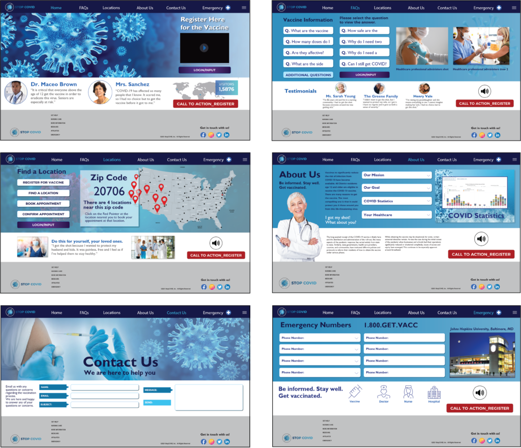
The first iteration of high fidelity mockups had too much information, buttons and images for a senior user. I discovered this through my card sorts and moderated testing. I did not include a footer on any of the screens. These issues were modified in later versions to have minimal information, text content, buttons and limited color palette. The Information Architecture changed to include additional screens based on user feedback. The HCD process drives the design and makes for a better MVP.
High Fidelity Prototype Screens
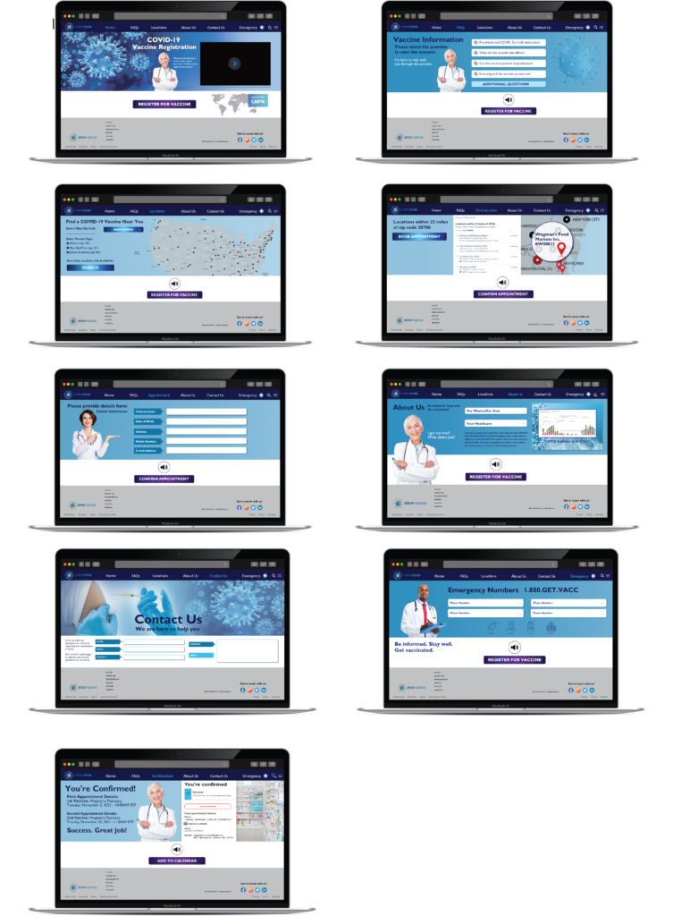
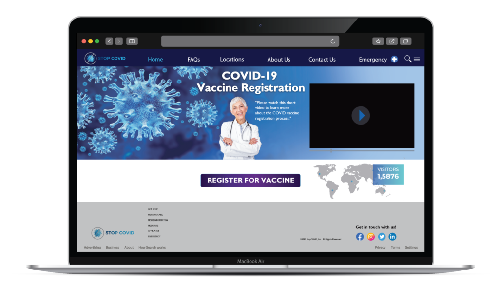
The Home Screen was redesigned from the second iteration to simplify the process for the users. Moderated testing resulted in users wanting to have a cleaner interface which did not have as many buttons or information to read. I added a single character, a senior physician, who could walk the user through the registration process via video instruction. The physician image appears on several screens and helps the user navigate to the appropriate information along the way.
The FAQs Screen gives the user has the option of pull down menus to get answers to their most pressing questions. Additional questions can be found when the user clicks the button and navigates to the Contact Us page to email providers for additional information.
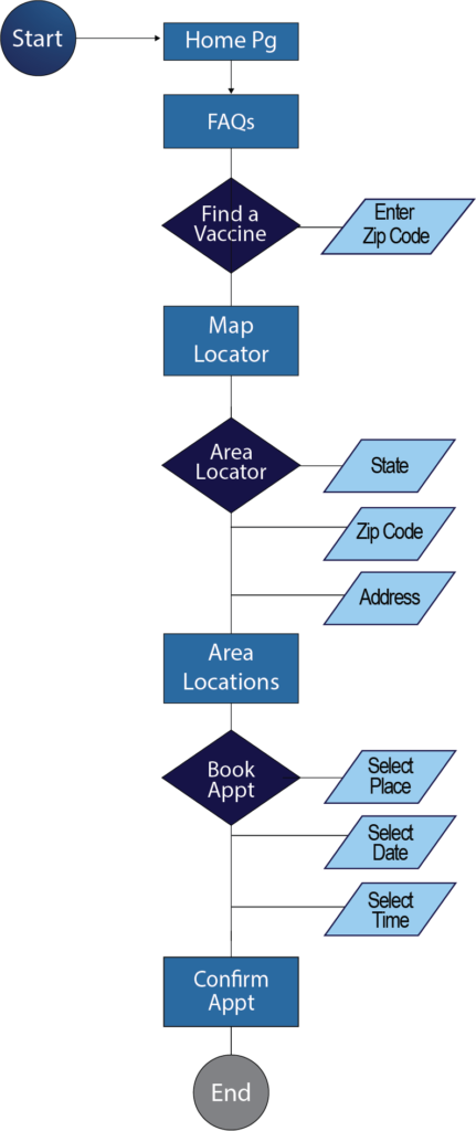
The Locations Screen is where the user can navigate to input their zip code to find a pharmacy or vaccine location nearest them. Audio prompts are here to assist the visually impaired user with the registration process. The user can speak their zip code information instead of keying in data.
The Contact Us Screen is where the user can input their email address with any questions that they may have regarding the registration process or vaccines in general. This is also where one could write to a medical provider for information.
The Appointment Screen is where the user can input their name, DOB, address, phone and email address in order to complete the registration process. Once this is done, they can navigate to the confirmation page.
The Contact Us Screen is where the user can input their email address with any questions that they may have regarding the registration process or vaccines in general. This is also where one could write to a medical provider for information.
The Emergency Screen was added so that the user could find critical information that they needed, such as nearest hospitals, clinics, pharmacies and other vaccine locations.
There was no Confirmation Screen designed at this iteration stage. The Appointment Confirmation Screen was added so that the user could verify their appointment date and time. This is one of the most critical screens in the process and final in the series.
The friendly physician has walked the user through a successful registration process. I added this screen after doing moderated and unmoderated testing methods.
5. Test and Validate
What I learned: The insights that I gained through Primary and Secondary Research helped me to further understand the senior user. Empathy for seniors allowed me to understand their needs for accessibility and helped me to create a site that was more user friendly for someone with impaired vison, hearing and mobility. Lack of comfort with technology was also a big factor when considering the senior user. In aditional iterations, I would create perhaps a way that could enable them to use the interface by touch.
I did both moderated testing and unmoderated testing of my prototype with 2 seniors at the local Starbucks. and 3 colleagues via Skype. For the moderated testing, I took my laptop and asked 2 customers would they mind if I could have a moment of my time to test my prototype. I offered to buy both coffee, but neither took me up on the offer. They were just happy to help me out with this task. I asked and watched as they went through the steps of “pretend” registering for a COVID vaccine. Both (1 man, 1 woman) understood the process and said that it was very easy to do. One commented that the text could be a bit larger because he had glasses. All in all, it was a successful test and my methodology and hypothesis worked. Senior users feel more comfortable and will engage in a task if they are guided through the process with prompts.
The 4 colleagues that I tested, had no issues with understanding the UI or in interacting with the prototype to “register” for the vaccine. Despite the ease of use of the MVP, Joseph indicated that he was sent a link by his county government that led directly to a site to register. He said that the process was so easy and took any guesswork out of having to register.
Conclusion: 4 of 6 users/participants, or 66.7% would register online and found this site easier to understand, navigate and ultimately register for the vaccine.
83.33%
3
Iterations
12
Sleepless Nights

